It’s a good idea to perform some sign planning before you consider contacting a Langley Sign Company. While Sign Hub Langley will organize and create the sign for you, it will save you time and money if you start by limiting the options. A plan will also enable you to picture the finished item before spending money building it. You’ll be more pleased with the outcome the more preparation you undertake.
Keep it basic
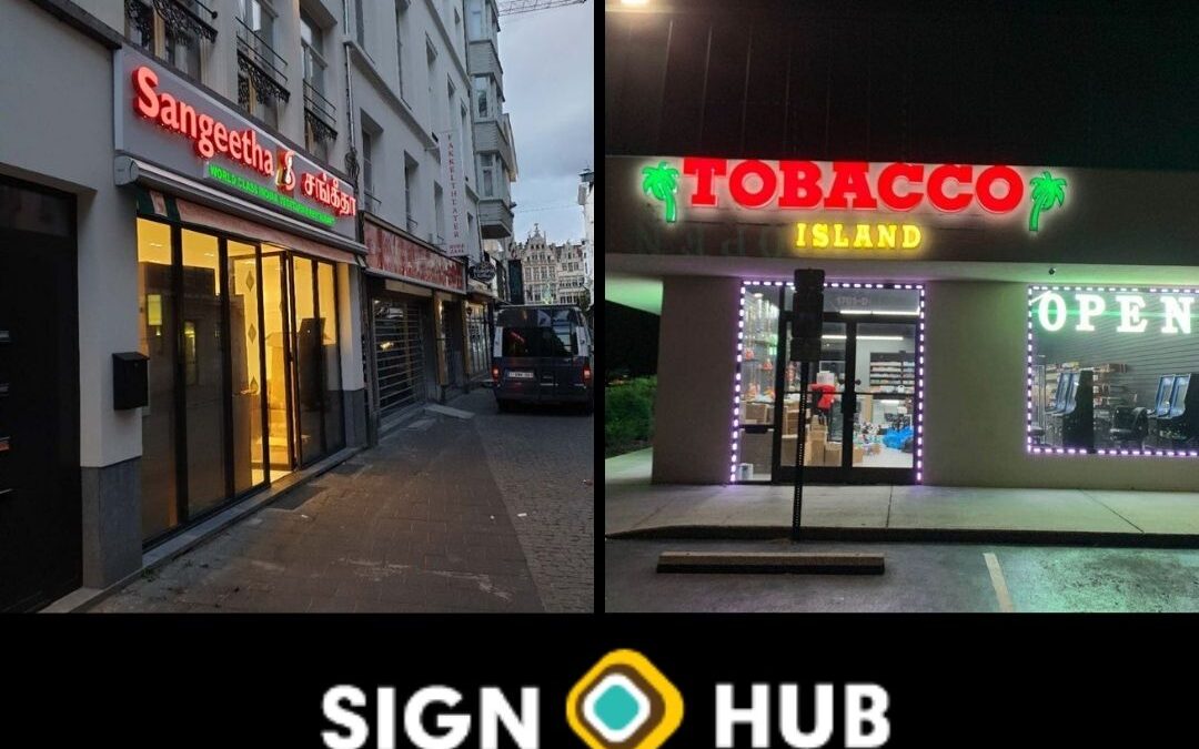
In Langley some of the best signage is also the most straightforward. If you stroll through crowded shopping areas, you might notice that the signs that capture your eye all share a similar simplicity. While signs with intricate, complex, or multicolored designs might be beautiful, they can lack a clear focal point. The design obscures the essential fact.
The KISS (Keep it Simple, Stupid) tenet is well known. This idea originated in design, primarily engineering, and applies equally to sign plans. According to the KISS principle, systems perform best when they are straightforward and devoid of extraneous complexity. Designing signs should prioritize simplicity. In his 10 Laws of Simplicity, the designer thought leader and former professor John Maeda ranked “reduce” as the first rule.
First, we must comprehend the primary goal of signs for Langley businesses: to attract attention from passersby and appreciate simplicity’s effectiveness in sign design. As marketers like, the direct message on your character, or the “call-to-action,” must be understandable enough to be read in various contexts. If your business is street-facing, you must ensure those passing cars and crowded pedestrians notice your sign. Signage for mall shops must stand out from the crowd of other characters vying for the attention of potential customers.
The eye has trouble locating the focal emphasis when a sign includes too many competing elements, such as many typefaces, colors, and visuals. So it simply blurs. You are lost, and so is your potential customer. The practical design of a sign draws attention to its primary message. Your message receives “emotional support” from the graphic components.
Select a Primary Goal
The most effective signs in Langley have a clear central message. Finding the sign’s focus begins with asking yourself why you require it in the first place.
- Consider the following inquiries for yourself:
- What do you hope to accomplish with the sign?
- Is the character solely used for branding?
- Do you only want people to be aware of your openness?
- Are you running a special at your company?
- Would you like to highlight your primary goods and services?
- Do you wish to impart knowledge or express emotion?
A helpful activity is to express your primary objective for the sign in the shortest feasible language. You can sharpen the emphasis by posing additional queries after articulating the primary purpose.
Goal: “I want people to buy since I’m selling women’s apparel.”
Do you have any items in your sale that are more crucial than others? Is there a well-known brand-name product on sale that will draw customers into the store so they may make more purchases?
You can highlight one or two well-liked products that will draw in passersby instead of trying to cram the entirety of your offer onto a store sign.
Using White Space
White space is a concept used by designers to describe undeveloped space. The canvas is the ground. A proper balance of unfilled white space makes a sign simpler to see, regardless of the “canvas” of the movement—whether it is composed of plastic, metal, fabric, or wood. Fewer design components and text are typically used to achieve this. The clever use of white space enhances the legibility of a sign.
Set Font Limits
Fewer fonts are utilized in designing some of the best Vancouver signage we see (and create). To achieve consistency, contrast, and legibility, uses no more than one, two, or three fonts. If you use too many typefaces, your sign may appear cluttered. Your message will be more clearly conveyed if you use one or two typefaces for the heads and one for the body of the sign’s text.
Use contrast
Ineffective sign design and contrast are crucial. The plan will be challenging to read and lack focus if the typefaces, images, and photos have similar tones. Signs are simpler to read, especially from a distance, when they have contrast (black lettering on a white or light-colored background, for example).
If you’re looking for a Langley sign Company, Sign Hub can assist you in finding the ideal option and offer a complimentary sign design consultation. Call us Today